With Christmas just round the corner, what better time to look at death penalty statistics? From these lists I thought I'd compare the GDP of countries who have banned the death penalty with those where it is still permitted (so the first list and the last list on that page). For GDP I've used this, primarily the IMF numbers, but also the CIA World Factbook ones when a country wasn't in the IMF. After excluding countries that don't have easily obtainable GDP data, our dataset features 69 countries who still permit the death penalty and 91 that have banned it.
First up, let's compare mean GDPs of countries that have banned the death penalty with those that permit it:
Mean GDP of countries permitting the death penalty: 441,481 million USD
Mean GDP of countries that have banned the death penalty: 258,376 million USD
and looking at means the countries that still have the death penalty have much higher GDP. However, mightn't a few countries (mostly the USA, but also Japan and China) be dragging the death penalty mean up? Let's compute the median instead:
Median GDP of countries permitting the death penalty: 21,308 million USD
Median GDP of countries that have banned the death penalty: 31,511 million USD
and now it's the countries that have banned the death penalty that have the higher GDP. (Of course, using mean for something as skewed as GDP was silly to begin with, but it's always good to illustrate this sort of thing.)
Interestingly, the median GDP of all the countries in the world is 21,749 million USD, a figure incredibly close to that of those permitting the death penalty. You can read what you like into that.
Sunday 19 December 2010
Thursday 16 December 2010
Rough stats: What is everyone studying?
With the recent news surrounding the proposed rise in tuition fees in the UK, I thought I'd see how many more students we have these days. The claim is that with more than ever before going to university it's impractical for every student to be funded by the taxpayer, but how many more are there?
I've rifled through the Higher Education Statistics Agency for figures, and my first graph is of total students numbers since 1996/97:
 A pretty clear trend, then. Although there are a couple of caveats. The main one is that I have plotted total undergraduates, which doesn't separate international students from UK ones, which obviously muddies the water a bit. The other is that my y-axis starts at 1 million, so the increase looks a little more dramatic than it is (although a 25% increase is still pretty big).
What I find most interesting about this graph, however, are the two places where the trend gets interrupted. They represent when key changes were made to how much a degree would cost - the first being when tuition fees were initially introduced, and the second when top-up fees (trebling the cost of most courses) came in. It doesn't seem that these two measures have had long-term impacts on the increasing number of students, but eyeballing it is obviously pretty dangerous, and since we don't have data prior to 1996 we can't really say much about earlier trends either.
So we know there are more students, but what are they studying? Again, I've looked at undergraduates only, and plotted the numbers of students studying various subjects from 2002/03 to 2008/09. There are subject-by-subject data, but to try and make it close to comprehensible I've used HESA's 19 subject 'areas'. For reference, I've listed which subjects each subject area includes at the bottom, as it can explain a lot of the relative popularity of each.
 It's not a particularly good graph, I know (and you probably need to click on it to see it properly), but I just wanted an overview to see if anything leapt out. (Don't worry about some of the colours being quite similar - the legend is arranged to match up with the order the lines appear on the far right of the plot, so it should be just about decipherable.)
First of all, why only from 2002/03? The answer is because there seems to be a dramatic change in how degrees were classified in the datasets I found. Prior to 2002 around 100,000 students were categorised as doing a 'combined' subject, but this suddenly dropped to just 10,000. At the same time various other subjects saw massive jumps in numbers - clearly most of the combined subjects were now being counted amongst other categories, and so it's easiest to just look at the data from this point onwards.
What are the main trends? Most subjects seem to be gradually increasing, as we might expect, but there are some that stay roughly constant, and some that drop considerably. In particular, computer science is having a terrible time of it, with a huge drop over the last seven years.
A better way to look at these data, however, is to consider what proportion of undergraduates are studying which subjects, rather than their absolute numbers. This gives us a clearer picture of the changes in the makeup of our student population, and should highlight which subjects are just increasing in line with the overall surge in student numbers, and which are losing out or doing better still.
 It might not look like too much has changed, but you can see plenty of subjects' lines aren't quite as steep as they were. One can now identify with slightly more confidence which subjects are getting more than their fair share of new students.
As you've probably noticed, this 'analysis' is pretty rough and not particularly scientific. The main warning I should probably provide is that you shouldn't read too much into the subject area headings. For instance, something like biological sciences seems to be getting a bigger share of the pie, but this doesn't mean biology is. From 2002/03 to 2008/09 biology increases from 17,390 undergraduates to 18,885, whereas sports science goes from 15,755 to 31,370.
A subject-by-subject analysis might be forthcoming, should I get bored enough over the festive period, but for now I must resist. All the data are available for free here, though. So if you're super keen you could poke around it yourself. You never know, you might be able to work out why statistics has dropped from 1,680 undergraduates to 1,325. It seems totally inexplicable to me...
--------------------------
Those subject areas in full...
Business & administrative studies: Broadly-based programmes within business & administrative studies; Business studies; Management studies; Finance; Accounting; Marketing; Human resource management; Office skills; Hospitality, leisure, tourism & transport; Others in business & administrative studies
Subjects allied to medicine: Broadly-based programmes within subjects allied to medicine; Anatomy, physiology & pathology; Pharmacology, toxicology & pharmacy; Complementary medicine; Nutrition; Ophthalmics; Aural & oral sciences; Nursing; Medical technology; Others in subjects allied to medicine
Creative arts & design: Broadly-based programmes within creative arts & design; Fine art; Design studies; Music; Drama; Dance; Cinematics & photography; Crafts; Imaginative writing; Others in creative arts & design
Social studies: Broadly-based programmes within social studies; Economics; Politics; Sociology; Social policy; Social work; Anthropology; Human & social geography; Others in social studies
Biological sciences: Broadly-based programmes within biological sciences; Biology; Botany; Zoology; Genetics; Microbiology; Sports science; Molecular biology, biophysics & biochemistry; Psychology; Others in biological sciences
Engineering & technology: Broadly-based programmes within engineering & technology; General engineering; Civil engineering; Mechanical engineering; Aerospace engineering; Naval architecture; Electronic & electrical engineering; Production & manufacturing engineering; Chemical, process & energy engineering; Others in engineering; Minerals technology; Metallurgy; Ceramics & glasses; Polymers & textiles; Materials technology not otherwise specified; Maritime technology; Biotechnology; Others in technology
Languages: Broadly-based programmes within languages; Linguistics; Comparative literary studies; English studies; Ancient language studies; Celtic studies; Latin studies; Classical Greek studies; Classical studies; Others in linguistics, classics & related subjects; French studies; German studies; Italian studies; Spanish studies; Portuguese studies; Scandinavian studies; Russian & East European studies; European studies; Others in European languages, literature & related subjects; Chinese studies; Japanese studies; South Asian studies; Other Asian studies; African studies; Modern Middle Eastern studies; American studies; Australasian studies; Others in Eastern, Asiatic, African, American & Australasian languages, literature & related subjects
Law: Broadly-based programmes within law; Law by area; Law by topic; Others in law
Computer science: Broadly-based programmes within computer science; Computer science; Information systems; Software engineering; Artificial intelligence; Others in computing sciences
Physical sciences: Broadly-based programmes within physical sciences; Chemistry; Materials science; Physics; Forensic & archaeological science; Astronomy; Geology; Science of aquatic & terrestrial environments; Physical geographical sciences; Others in physical sciences
Education: Broadly-based programmes within education; Training teachers; Research & study skills in education; Academic studies in education; Others in education
Historical and philosophical studies: Broadly-based programmes within historical & philosophical studies; History by period; History by area; History by topic; Archaeology; Philosophy; Theology & religious studies; Others in historical & philosophical studies
Medicine & dentistry: Broadly-based programmes within medicine & dentistry; Pre-clinical medicine; Pre-clinical dentistry; Clinical medicine; Clinical dentistry; Others in medicine & dentistry
Mass communications & documentation: Broadly-based programmes within mass communications & documentation; Information services; Publicity studies; Media studies; Publishing; Journalism; Others in mass communications & documentation
Architecture, building & planning: Broadly-based programmes within architecture, building & planning; Architecture; Building; Landscape design; Planning (urban, rural & regional); Others in architecture, building & planning
Mathematical sciences: Broadly-based programmes within mathematical sciences; Mathematics; Operational research; Statistics; Others in mathematical sciences
Agriculture & related subjects: Broadly-based programmes within agriculture & related subjects; Animal science; Agriculture; Forestry; Food & beverage studies; Agricultural sciences; Others in veterinary sciences, agriculture & related subjects
Combined
Veterinary science: Pre-clinical veterinary medicine; Clinical veterinary medicine & dentistry
(There were occasional changes to these lists throughout the years in our dataset, with these being the details of the 2008/09 data. Probably an unimportant detail, but worth bearing in mind.)
Tuesday 7 December 2010
Statistics - not always black and white
I was a little startled by the front page of the Guardian this morning. It featured an article claiming that David Lammy, MP for Tottenham, had uncovered shocking evidence of racism in the admissions procedures of Oxford and Cambridge - Britain's two most prestigious universities.
Some of the figures are certainly cause to raise an eyebrow - just one black Briton of Caribbean descent accepted by Oxford last year? One college hasn't admitted a black student in five years? Surely this is evidence of institutionalised racism at its worst! Or is it? That one black Briton of Caribbean descent was of just 35 applicants, and a spokeswoman for Oxford points out that "black students apply disproportionately for the most oversubscribed subjects". This is before you start thinking about how many people don't disclose their ethnicity (on all the forms you're sent when you apply), and so on.
Clearly this is somewhere where some better statistical thinking would help, but it does not seem to be forthcoming. There are plenty of points that can be dissected and discussed, but I'm just going to pick on one quote (posted on this blog) from the honourable member, which I think highlights the quality of the analysis:
"Why is it that 25 of 84 Black applicants received offers from Keble College but just 5 of 64 Black applicants received offers from Jesus College over the same 11 year period?"
On face value, this seems quite a big difference. 25 out of 84 is 30%, whilst 5 out of 64 is just 8%. Surely that's not down to chance? That is presumably what we're supposed to think, but let's dig a little deeper. The Guardian have published the admissions data for each college, and it's from these that these two figures come. A quick look reveals that Lammy has picked out the two colleges with the highest and lowest rate of admission for black applicants, and this is when alarm bells should start ringing.
The sharpshooter fallacy is a classic. An old Texan (not a great shot) fires at the broad side of a barn, and then draws a big target whose centre is where his biggest cluster of shots happened to land. He points to this as proof of his superb marksmanship. This is an essential aspect of statistics - if you don't decide what you're looking for before you collect your data, it's easy to find results that seem implausible. If Lammy had had some reason to chose Keble and Jesus before he'd looked at the data, then the difference he highlights might mean something, but as it is could it just be down to chance?
Fortunately, it's a pretty easy thing to check. Let's assume that a black applicant has the same chance of being admitted to any Oxford college. On average, 22% of black applicants over the last 11 years were admitted, so I'll use this as my baseline. I'm going to simulate new versions of the real dataset, where I take the (real) total number of black applicants to each college, and then see how many get accepted by giving everyone a 22% chance. If we do this, then on average the college with the highest success rate admits 35% of its black applicants, whilst the average lowest success rate is 11% - a spread of 24%. David Lammy highlights a difference of 22% between best and worst as indicative of... something, when in fact it's pretty much what you'd expect.
There are doubtless plenty of valid issues - some of which Lammy does try to raise - that these data could highlight, had they been analysed properly and not obfuscated by a cloud of sensationalism. Lammy says that "the variations between colleges in their admissions statistics is a pertinent point and Oxbridge should be doing more to find out why such variations exist". Perhaps if he'd employed a statistician he would be able to answer this one for himself.
Thursday 2 December 2010
Articulate
Mostly for my benefit, my current crop of articles over at significance online:
November 3rd Just not cricket - the Pakistan spot fixing scandal
November 8th Judging the Jabulani
November 9th Baby names
November 12th Gameshow maths - Million Pound Drop Live
November 18th Formula Fun - comparing recent scoring systems
November 23rd Keeping it Royal (with apologies)
December 2nd Snowbusiness
Saturday 30 October 2010
The Sound of Silence
It's all been a bit quiet here lately. Too quiet, if you ask me. Alas, my output has been somewhat reduced by an exciting new website from the Royal Statistical Society, namely the online home of their quarterly magazine, Significance. (Do you see what they did there?)
So yes, what would have been content for Statscream has turned into content for Significance, and so whilst I have various things in the works that I'm pretty sure will only be suitable for this corner of the Internet, there will be numerous posts where I merely link to my pieces elsewhere.
My opening gambits, therefore, are:
Anyone Fore Golf - a look at whether there is evidence of home advantage in the Ryder Cup; and
Putting the Man in Man Booker - investigating the gender gap in literary prizes.
I have even become dangerously web 2.0 and set up a Twitter account - statacake - thus increasing my statistical Internetular outlets to 3. The hypothesis "do more means of communication result in less content" will be tested in due course...
Saturday 18 September 2010
Rank Outsiders
The latest round of international University rankings recently came by, so I thought I'd whip up a quick graph to look at how countries performed compared with their GDP. As usual, I didn't fancy doing anything complicated, so I just totalled up the scores for every university from each country, and plotted them against their GDP according to the IMF in 2009.
 So there you go. Fairly scattered around a (least squares) line of best fit, with an R-squared of 0.7, but the UK is by far the most outlying country, ostensibly punching well above its weight. Other things to compare university rankings with are available.
 So there you go. Fairly scattered around a (least squares) line of best fit, with an R-squared of 0.7, but the UK is by far the most outlying country, ostensibly punching well above its weight. Other things to compare university rankings with are available.
Sunday 12 September 2010
Notorious Voting Scenes
One of the unceasing complaints about the Eurovision Song Contest is that ever since the introduction of televoting the contest has been dominated by 'political' (particularly diaspora) voting. In an attempt to combat this, the organisers recently introduced a part jury, part televote system, where the points awarded by a jury of 'experts' would be given equal weight to those from the televote. In theory the juries will be much more objective, and less easily swayed by 'extramusical' matters.
After the event the scores awarded by the juries are revealed, so it's possible to compare the juries' scores with the televote scores, theoretically giving us an indication of how much the voting public are affected by, say, a country's foreign policy, or who's controlling their gas supply. To make it easy to visualise, I've made a map showing all the countries who competed in the 2010 contest, and colour-coded it according to how much the televote rankings differed from the jury vote. Darker red means a country did much better in the televote than the jury vote, darker blue means the opposite. (These data are taken from the semi-finals as well as the final, taking the final results if a country appeared in both.)
The common theories are that Eastern European countries dominate the contest because "they all vote for each other" and that western nations are unfairly disadvantaged. So what does our map look like? (Click to make it bigger.)

My initial reaction to this is that there's no particularly obvious pattern - both east and west seem to 'benefit' from the televote with Turkey, Serbia and Moldova in the east as red as France and Spain in the west. Russia - often perceived as the biggest beneficiary of political voting - is a lighter red, finishing 4 places higher in the telephone than the jury vote, whilst the Netherlands are almost in the same boat finishing 3 places higher. Eastern Europe is a bit of a mix, whereas it's the Scandinavian countries - Iceland, Norway, Sweden, Finland and Denmark - who seem to merit their 'usual suspects' status. Of these, only Norway are a shade of blue, and as the hosts this might be expected anyway (a common theory is that because a country hosts as a consequence of winning the previous year's competition, voters are less willing to vote for them to win again so soon).
So maybe the public aren't as politically minded after all, or maybe the juries are less objective than the organisers would hope. Alternatively, with so many countries densely packed into Eastern Europe it's inevitable that some will benefit and some will lose out from votes being shared around. These are only the results from one year, so it's not a great way to try and separate patterns from anomalies. For instance, this year Spain got to perform twice in the final after a stage invasion, which seems a fairly reasonable explanation for their 'overperformance' in the televote. A few more years of split voting should hopefully clarify the picture.
A final observation, which is rather cute (and perhaps a little reassuring) is that both Germany and the UK have a neutral colour in this map - they finished in the same position in the televote as the jury vote. For those who don't follow these things, Germany won the contest whilst the UK finished dead last. You can say what you like about dodgy voting, but they get the winner and loser spot on.
Monday 2 August 2010
A thorough investigation into popular opinion of statistics
 (In the interests of full disclosure, I removed a bunch of results for things such as "9 out of 10 statistics are made up" which generated artificial hits for lower numbers (10 in this example).)
I think the graph speaks for itself: most people think most statistics are made up. A couple of bonus (not entirely made up) stats are that the modal hit was "87% of statistics are made up", and the mean hit was "74.8% of statistics are made up". So next time someone tells you an alarming statistic don't worry, three-quarters of the time it will have just been made up. Possibly.
Saturday 10 July 2010
Mega Football Versus Small Octopus
On my previous post about Paul the octopus, a commenter asked a couple of questions which I thought merited a separate post to address. The first:
"There is of course a detail that you've (likely intentionally) overlooked, which is that the chance of winning a football match is not usually exactly 50-50. Given that Germany are one of the world's top teams they could be expected to win more matches than they lose.
Having done a bit of research, I've discovered that since Paul started making his predictions (at least for the public) at the start of Euro 2008, Germany have won 22 games, lost only seven and drawn four. Their win record thus stands at 66.7% over the last two years, which is probably a fairer representation of their chances of victory in a randomly determined match.
Can your analysis take account of this?"
This is an interesting question, and it boils down (as happens surprisingly often with probability) to a matter of perspective.
Suppose you have a friend called Peter who knows a bit about football. He's successfully predicted the results of the same six games that Paul has. Since Peter knows about football, he knows that the chance of Germany beating Australia (for example) was probably not exactly 50%. Does this matter?
Well, not really. The analysis we carried out last time was testing a specific hypothesis - that Paul was picking teams at random. This was our 'null' hypothesis, our default state of belief, if you will. Our 'alternative' hypothesis was that he has done better than you'd expect him to by chance alone. In testing this I claimed that Paul's chance of predicting the winner - if he's just picking at random - is 50/50. Crucially, this doesn't depend on the real chances of either outcome. This might not seem intuitive at first, but imagine Paul was picking the team after the game had happened - at this point the winner is known, so if he's picking at random he has a 50% chance of picking the right team. Since Paul's picking doesn't (we presume) interfere with the outcome of the game, if we're assuming he's picking 'blind' then it doesn't matter whether he chooses before or after the result is determined.
So what about Peter? We could test the same hypothesis and we would come to the same conclusion. The only difference is that we're not (as) impressed because we would expect him to be doing better than chance anyway - he has extra information to help make his decisions. Paul, meanwhile, is just an octopus, and so no-one would expect him to know anything (except possibly how to count to eight).
On a separate note, and with regards to the probabilities we've calculated telling us that Paul has some apparently incredible ability, it's worth stressing that that isn't what we've shown either. All we've done is shown that if Paul was picking at random (as - call me a sceptic - he probably was) he's just got quite lucky. This in itself isn't really that remarkable though - Paul was only brought to our attention after a string of successful predictions. There may well have been hundreds of other octopuses/coins/babies making similar predictions and getting them wrong, and we've just got to see the one who got them right. If you see a golfer hit a hole in one it seems remarkably improbable, but if you think about all the millions of shots that didn't go in, that single event occurring doesn't seem so incredible.
But anyway, on to the second question:
"Secondly, I would note that there are three possible results in most football matches (win, loss, draw) rather than two, although there seems to be no way for Paul to predict anything other than a win or loss. So far none of the matches he has made predictions for have resulted in a draw, but the possibility exists nonetheless. How does that affect the overall dataset?"
This is a good point (and one which I ignored previously for the sake of keeping things simple), and an interesting one to discuss.
As we've discussed, if our (null) hypothesis remains that Paul is picking at random, his probability of picking either team is just 0.5. However, since it's not certain that one of those teams will go on to win the game, his chance of picking the winner is actually going to be less than that. For instance, if 2 in 3 games end in one of the two teams winning, Paul then has a 1 in 3 chance of picking the team that wins, a 1 in 3 chance of picking the team that loses, and a 1 in 3 chance of there being no winning team to be picked at all.
What this amounts to is that Paul's chances of correct predictions are in fact even lower than those we'd already calculated, but unless you are willing to believe an octopus has been keeping an eye on the football pages of Bild, the chances are he's just very lucky.
Wednesday 7 July 2010
I'd like to be, under the sea...
An octopus named Paul has been making the news due to his alleged ability to correctly predict the winner of Germany's international football matches. It started with Euro 2008, where he supposedly called 4 of Germany's 6 games correctly. The BBC reported this as "nearly 70%", which is perhaps being a little generous, as a 70% success rate sounds rather more impressive than correctly making 4 out of 6 50/50 guess.
For the World Cup Paul has (apparently) correctly picked the results of Germany's 5 games up until tonight's semi-final, where he has controversially chosen Spain to triumph. So is Paul a Predicting Phenomenon, or just lucky?
We'll start with his World Cup picks where he's got 5 out of 5 right (so far). Our null hypothesis is that Paul is merely picking at random, and since each pick is a 50/50 choice this is the same as saying the probability he picks correctly is 0.5. The probability of getting 5 correct selections is then the same as tossing a coin 5 times and getting 5 heads. This is easy to compute, as we just multiply the probabilities together to get 0.5 x 0.5 x 0.5 x 0.5 x 0.5 = (0.5)5 = 1/32 or about 3%. That seems pretty unlikely (although not too astronomical).
Amusingly, were we performing a statistical hypothesis test, we would in fact be likely to say that the data are not consistent with the null hypothesis that Paul is picking at random. This is because the probability that he would have got all 5 predictions correct is less than 5%, the standard cut-off used in hypothesis testing (we would say "the data are significant at the 5% level"). Of course, this highlights the danger of the common practice of just looking at a p-values (which is what our probability above is) and concluding that the null hypothesis must be true or false - it would take a rather stronger run of successes to convince most people that an octopus could really correctly predict football results. A 5% significance level means that even if our null hypothesis is true, an outcome will appear 'significant' (and we would question the null hypothesis) if the chances of it happening are less than 1 in 20. This really isn't that unlikely.
We do have more data, however, thanks to Paul's Euro 2008 picks. This takes his record to 9 correct out of 11 - is this statistically significant as well? Once again we want to calculate the probability that Paul would get this success rate picking at random, but it's slightly harder to work out this time. What we want to know is the probability that Paul would be at least this successful were he picking at random. So whereas before we just had to calculate the probability of 5 heads from 5 tosses, here we need to calculate the probability of 9 heads from 11 tosses, 10 heads from 11 tosses, and 11 heads from 11 tosses; adding these three probabilities up will tell us how 'lucky' Paul is.
So 11 heads from 11 tosses is easy, like the case with 5 out of 5, it's just 0.5 multiplied by itself 11 times. What about 10 heads, or 9? Things get a little trickier. Whilst there is only one way to get 11 heads from 11 tosses, there are several ways to get 9 heads. This might sound odd, but if you imagine tossing a coin twice, you can get either:
1) Tails followed by tails (TT)
2) Heads followed by heads (HH)
3) Tails followed by heads (TH)
4) Heads followed by tails (HH)
All of these outcomes are equally likely, but two of them (HT and TH) correspond to getting one head and one tail, and it's this which makes computing the probability of 9 heads from 11 tosses a bit tricky. Fortunately there's a simple formula for calculating this, known as the binomial coefficient. I'll spare you the details (since it's mathsy, and you can read Wikipedia if you like), and tell you how to use Google to get the number you want. Just type in "x choose y" and Google will tell you how many ways there are to get y heads from x coin tosses. Here, we want 11 choose 9, which gives us 55 ways to get 9 heads from 11 tosses. The probability of getting any one particular combination of 9 heads and 2 tails is just 0.5 multiplied by itself 11 times; once for each 50/50 coin toss. Since there are 55 different ways of doing this we then want 55 times this to allow for each possibility. So the final probability that one would get 9 heads from 11 tosses is 55 x (0.5)11, about 2.7% or 1 in 37.
Similarly, we see there are 11 ways to get 10 heads from 11 coin tosses, so the probability of exactly 10 heads is 11 x (0.5)11, about 1 in 186.
We can now put these three probabilities together and add them up to give Paul's prediction p-value as (1 + 11 + 55) x (0.5)11 = 3.3% or about 1 in 30.
So even taking Paul's two mistakes into account, his four extra correct picks mean the chances of him managing his record at random have only increased marginally, and his punditry powers which remain statistically significant.
So how important is the match tonight? He's selected Germany's opponents Spain to progress, and of course if he's right it will be further evidence that his powers are not merely down to chance, so what if he's wrong? It would take his world cup prediction record to 5 right out of 6, would this still be statistically significant? The probability of getting at least 5 out of 6 right is calculated the same as our example above with 9 out of 11. The probability of 6 out of 6 is just (0.5)6, and there are 6 ways of getting 5 heads from 6 tosses, so the probability of exactly 5 out of 6 is 6 x (0.5)6. Adding these together we get a probability of about 11%, or 1 in 9. With just one wrong choice his picking would stop being statistically significant.
What about his lifetime record? That would go to 9 out of 12. I'll spare you the maths now and just tell you that the probability of getting at least 9 out of 12 right is 7.3%, or 1 in 14. Again, statisticians would stop heralding Paul as the mussel eating messiah.
So if he's wrong tonight he'll seem unremarkable (to p-value cultists, at least), whilst if he's right he'll be pushed further towards probabilistic stardom. This does of course demonstrate the dangers of trying to perform statistics entirely through p-values (which many practitioners do), and how susceptible they can be towards even a single result one way or the other.
Now I'm off to watch the football where I'll be rooting for the Germans. If they win the World Cup it means England come joint second, right?
Tuesday 1 June 2010
Eurovision Eurovision Eurovision
Eurovision has been and gone, and love it or hate it it provides some nice data which I can use to demonstrate some statistics (hurrah). Let's get eurostatting:
One commonly held belief about Eurovision is that it's much better to perform early or late in the running order rather than somewhere in the middle. This is thanks to the serial position effect; we generally remember items in the middle of a list less well than those at the beginning (primacy effect) and end (recency effect). This year, however, a change was made to the Eurovision voting process - viewers could vote for their favourite song all the way through the competition, not just after hearing the final act. When I first heard this I was a bit nonplussed - how does letting people vote before they've heard all the songs make things fairer? I wonder if it will even have any effect...
Predictably, this led me to stay up til the early hours playing with data as I tried to answer two questions:
1) Is there evidence of a primacy/recency effect in Eurovision results?
2) Were there any appreciable changes to voting patterns this year, after the introduction of the new voting system?
To start with (as always) I go data mining. Thanks to the Internet, I can quite easily get hold of the results of as many Eurovision finals (and from 2004 onwards, semi-finals) as I'd like. I decided to take my dataset from 1998 onwards, as this is the first year where universal televoting was recommended, and so seem the most relevant to the present day.
So how do we go about investigating question 1? Whenever I start exploring data I always like to try and make some plots - the human eye is great at picking out patterns (admittedly sometimes where there aren't any to begin with...), and graphics are a great way to communicate data. So which data do I want to look at? I'm interested in identifying whether performing later or earlier means a country does better, and so for that I'm going to want the order in which they performed and the position they finished in. Is this good enough? Not quite. Because the number of countries entering the contest has fluctuated over the years (as well as differences between finals and semi-finals), from year to year the numbers are not yet comparable. For example, knowing a country finished 10th or performed 15th is a little meaningless if we don't know how many others it was competing against.
To make our numbers comparable we need to standardise them - fortunately a fairly easy procedure. For each of our individual contests we just divide a country's finishing position and performance order by the total number of countries competing in that particular competition. For example, a country finishing 25th out of 25 will be converted into a finishing 'score' of 25/25 = 1. Meanwhile, a country finishing first will have a lower finishing 'score' the more countries it was competing against (finishing 1st out of 10 would score 0.1, and is a better result than finishing 1st out of 5, which would score 0.2). The same logic is applied to performance order, so performing last always scores 1 and performing 1st scores less the more countries that are competing.
Now that we've standardised our data, we want to get back to plotting them, right? But what's the best sort of plot to use? All of our data are pairs of points - one finishing score and one performance order score, so can we just plot these as a scatter graph? Let's try that and see what happens:

Yikes. That's quite a mess. There are no particularly obvious patterns, so what do we do now? I think we need to manipulate our data a bit more to make it more accessible (and amenable to a different type of analysis).
We're going to simplify the data a little. Rather than looking at the specific finishing position and performance order for every country, we shall instead split them into quartiles. That is, we reduce our data to whether a country performed in the first, second, third or final quarter of contestants in a competition, and similarly whether they finished in the top, second, third of bottom quarter. Doing this, we can tabulate the simplified results:

As is hopefully discernable, each column corresponds to a performance order position - 1 means the first quarter, 4 the last quarter. Similarly, each row corresponds to a finishing position - 1 means finishing in the top quarter and 4 in the bottom quarter. We're interested in whether performance order affects finishing position, so we can make these data a little easier to interpret if we take column percentages - that is, for each column we calculate what proportion of countries that performed in that quarter then finished in the top, second, third and bottom quarter.

It's still a bit of a sea of numbers, but we can already see some interesting results - countries performing in the first quarter of a contest tend to do quite poorly, with 35.8% of such countries finishing in the bottom quarter, and 67.9% (just over two-thirds) finishing in the bottom half. Pretty much the opposite happens for countries performing in the final quarter; 34.4% go on to finish in the top quarter and 63.9% (just under two-thirds) finish in the top half. It seems our initial hypothesis was only half right - there's evidence here of a recency effect but not a primacy one. But could this just be down to chance?
Here we are interested in testing a hypothesis, specifically whether there is evidence of an association between performance order and finishing position. In statistical terms, this is our 'alternative hypothesis'. This is as opposed to a 'null hypothesis', which for us is that there is no association between performance order and finishing position. What a hypothesis test does is look at the data and ask whether or not it seems plausible they could have come about under the null hypothesis, in other words, is the pattern we think we see above merely due to chance?
The data are now in a rather nice format with which to perform Pearson's chi-square test. Put simply, this test takes our null hypothesis (that performance order has no impact on finishing position) and looks at how much the actual results deviate from what we would expect were this really the case. It's a powerful procedure, but also a fairly simple one, and whilst I shan't go into the mechanisms of it here, the wikipedia page explains it fairly well, and is hopefully penetrable to most with some A level maths in them.
From our tables above, it looks like our null hypothesis of no relationship between finishing position and order performance is false, but what does the statistical test say? The main output of the test I'm going to use here is a p-value, which is a commonly used means of testing a hypothesis. Discussion of p-values is really a post in itself, so I shan't go into too much detail here. What I will say, however, is that in most cases if a p-value is calculated as being less than 0.05 many will consider this reasonable evidence that the data being investigated are not consistent with the null hypothesis. In our case, a p-value of less than 0.05 would imply that there is evidence that our data do not seem to agree with the null hypothesis of no association between a country's performance order and finishing position.
Running the test, we get a p-value of 0.0001, which is much, much smaller than 0.05. Consequently most statisticians (myself included) would be happy to conclude that the data do not seem at all consistent with the null hypothesis; there is evidence of an association between performance order and finishing position.
As for question 1 then, we've established that there does indeed seem to be a relationship between finishing position and performance order. I should stress however, that we haven't actually shown what sort of relationship it is. Our statistical test just tells us that our observed data deviate from what we would expect sufficiently much to suggest they aren't just being scattered at random (there are things we could do to investigate the relationship further, but I think that's a tangent that will have to wait for another day). From the tables above though, it seems that countries who perform later do better, whilst those that perform earlier to worse - there is evidence of a recency effect, but not a primacy one. Who'd've thought after two hours of music you wouldn't remember the opening act?
But anyway, now that's dealt with we can finally move onto our second question - do we have any evidence that with the introduction of a new voting system anything has changed? To test this, we'll use the data from this year's contest - two semi-finals and a final, and take a similar approach. One complication emerges, however - Spain performed twice in the final after a stage invasion during their first performance - how can we take this into account? I've decided to just drop them altogether from the analysis, as there does not seem to be an obvious way to include them, and they are clearly a rather distinct case from all the other entries.
Having done this, we once again, split performance order and finishing positions into quarters, and report our results in a table:

Or, we can conver to column percentages again (that is, for each performance order quarter we can see what proportion of countries finished in each quarter overall). You'll have to forgive the odd rounding error...

To the eye, it's not quite as clear cut as it was with the older data, although the largest proportion of countries appear in the top right and bottom left cells as before. If we look a bit further though, there's less convincing evidence - recall that earlier over two-thirds of countries who performed in the first quarter went on to finish in the bottom half, here that proportion is just 57.1%. Furthermore, until this year 63.9% of countries who performed in the last quarter finished in the top half, this year that figure is 50%, just what you'd expect. Maybe things have changed...
Let's forget the guesswork though, we can just do another Pearson's chi-square test, right? Well unfortunately we can't. Pearson's chi-square test requires us to have sufficiently many observations to make some of its underlying assumptions valid, and we just don't have enough data. Fortunately there is another test - Fisher's exact test - which we can use when our sample size is this small. Like Pearson's test, it's fairly easy to compute (although again I'll spare the details), and running it we get a p-value of 0.6381. This is rather large, and suggests that our data are consistent with the null hypothesis - in other words, it seems that performance order doesn't have an effect on finishing position under the system.
I would, however, not set too much store by this conclusion. As mentioned, this is based on just three 'contests' - two semi-finals and a final - and so our test is not particularly powerful. When we have fewer data it is much harder to convince ourselves that we have found evidence of some sort of relationship - there is too much that can change due to chance. For example, if you toss a coin 100 times and get 30 heads and 70 tails you'd be fairly suspicious about it being biased. If you tossed it 10 times and got 3 heads and 7 tails however, you'd probably just think this was reasonable for a fair coin, and think this disproportionate result was just down to chance.
Still, it's a promising start, and it will be interesting (assuming this new voting system is maintained) to see how future years' data stack up when combined with what we have. Maybe it's not so silly to let people vote as they go along after all...
One commonly held belief about Eurovision is that it's much better to perform early or late in the running order rather than somewhere in the middle. This is thanks to the serial position effect; we generally remember items in the middle of a list less well than those at the beginning (primacy effect) and end (recency effect). This year, however, a change was made to the Eurovision voting process - viewers could vote for their favourite song all the way through the competition, not just after hearing the final act. When I first heard this I was a bit nonplussed - how does letting people vote before they've heard all the songs make things fairer? I wonder if it will even have any effect...
Predictably, this led me to stay up til the early hours playing with data as I tried to answer two questions:
1) Is there evidence of a primacy/recency effect in Eurovision results?
2) Were there any appreciable changes to voting patterns this year, after the introduction of the new voting system?
To start with (as always) I go data mining. Thanks to the Internet, I can quite easily get hold of the results of as many Eurovision finals (and from 2004 onwards, semi-finals) as I'd like. I decided to take my dataset from 1998 onwards, as this is the first year where universal televoting was recommended, and so seem the most relevant to the present day.
So how do we go about investigating question 1? Whenever I start exploring data I always like to try and make some plots - the human eye is great at picking out patterns (admittedly sometimes where there aren't any to begin with...), and graphics are a great way to communicate data. So which data do I want to look at? I'm interested in identifying whether performing later or earlier means a country does better, and so for that I'm going to want the order in which they performed and the position they finished in. Is this good enough? Not quite. Because the number of countries entering the contest has fluctuated over the years (as well as differences between finals and semi-finals), from year to year the numbers are not yet comparable. For example, knowing a country finished 10th or performed 15th is a little meaningless if we don't know how many others it was competing against.
To make our numbers comparable we need to standardise them - fortunately a fairly easy procedure. For each of our individual contests we just divide a country's finishing position and performance order by the total number of countries competing in that particular competition. For example, a country finishing 25th out of 25 will be converted into a finishing 'score' of 25/25 = 1. Meanwhile, a country finishing first will have a lower finishing 'score' the more countries it was competing against (finishing 1st out of 10 would score 0.1, and is a better result than finishing 1st out of 5, which would score 0.2). The same logic is applied to performance order, so performing last always scores 1 and performing 1st scores less the more countries that are competing.
Now that we've standardised our data, we want to get back to plotting them, right? But what's the best sort of plot to use? All of our data are pairs of points - one finishing score and one performance order score, so can we just plot these as a scatter graph? Let's try that and see what happens:

Yikes. That's quite a mess. There are no particularly obvious patterns, so what do we do now? I think we need to manipulate our data a bit more to make it more accessible (and amenable to a different type of analysis).
We're going to simplify the data a little. Rather than looking at the specific finishing position and performance order for every country, we shall instead split them into quartiles. That is, we reduce our data to whether a country performed in the first, second, third or final quarter of contestants in a competition, and similarly whether they finished in the top, second, third of bottom quarter. Doing this, we can tabulate the simplified results:

As is hopefully discernable, each column corresponds to a performance order position - 1 means the first quarter, 4 the last quarter. Similarly, each row corresponds to a finishing position - 1 means finishing in the top quarter and 4 in the bottom quarter. We're interested in whether performance order affects finishing position, so we can make these data a little easier to interpret if we take column percentages - that is, for each column we calculate what proportion of countries that performed in that quarter then finished in the top, second, third and bottom quarter.

It's still a bit of a sea of numbers, but we can already see some interesting results - countries performing in the first quarter of a contest tend to do quite poorly, with 35.8% of such countries finishing in the bottom quarter, and 67.9% (just over two-thirds) finishing in the bottom half. Pretty much the opposite happens for countries performing in the final quarter; 34.4% go on to finish in the top quarter and 63.9% (just under two-thirds) finish in the top half. It seems our initial hypothesis was only half right - there's evidence here of a recency effect but not a primacy one. But could this just be down to chance?
Here we are interested in testing a hypothesis, specifically whether there is evidence of an association between performance order and finishing position. In statistical terms, this is our 'alternative hypothesis'. This is as opposed to a 'null hypothesis', which for us is that there is no association between performance order and finishing position. What a hypothesis test does is look at the data and ask whether or not it seems plausible they could have come about under the null hypothesis, in other words, is the pattern we think we see above merely due to chance?
The data are now in a rather nice format with which to perform Pearson's chi-square test. Put simply, this test takes our null hypothesis (that performance order has no impact on finishing position) and looks at how much the actual results deviate from what we would expect were this really the case. It's a powerful procedure, but also a fairly simple one, and whilst I shan't go into the mechanisms of it here, the wikipedia page explains it fairly well, and is hopefully penetrable to most with some A level maths in them.
From our tables above, it looks like our null hypothesis of no relationship between finishing position and order performance is false, but what does the statistical test say? The main output of the test I'm going to use here is a p-value, which is a commonly used means of testing a hypothesis. Discussion of p-values is really a post in itself, so I shan't go into too much detail here. What I will say, however, is that in most cases if a p-value is calculated as being less than 0.05 many will consider this reasonable evidence that the data being investigated are not consistent with the null hypothesis. In our case, a p-value of less than 0.05 would imply that there is evidence that our data do not seem to agree with the null hypothesis of no association between a country's performance order and finishing position.
Running the test, we get a p-value of 0.0001, which is much, much smaller than 0.05. Consequently most statisticians (myself included) would be happy to conclude that the data do not seem at all consistent with the null hypothesis; there is evidence of an association between performance order and finishing position.
As for question 1 then, we've established that there does indeed seem to be a relationship between finishing position and performance order. I should stress however, that we haven't actually shown what sort of relationship it is. Our statistical test just tells us that our observed data deviate from what we would expect sufficiently much to suggest they aren't just being scattered at random (there are things we could do to investigate the relationship further, but I think that's a tangent that will have to wait for another day). From the tables above though, it seems that countries who perform later do better, whilst those that perform earlier to worse - there is evidence of a recency effect, but not a primacy one. Who'd've thought after two hours of music you wouldn't remember the opening act?
But anyway, now that's dealt with we can finally move onto our second question - do we have any evidence that with the introduction of a new voting system anything has changed? To test this, we'll use the data from this year's contest - two semi-finals and a final, and take a similar approach. One complication emerges, however - Spain performed twice in the final after a stage invasion during their first performance - how can we take this into account? I've decided to just drop them altogether from the analysis, as there does not seem to be an obvious way to include them, and they are clearly a rather distinct case from all the other entries.
Having done this, we once again, split performance order and finishing positions into quarters, and report our results in a table:

Or, we can conver to column percentages again (that is, for each performance order quarter we can see what proportion of countries finished in each quarter overall). You'll have to forgive the odd rounding error...
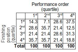
To the eye, it's not quite as clear cut as it was with the older data, although the largest proportion of countries appear in the top right and bottom left cells as before. If we look a bit further though, there's less convincing evidence - recall that earlier over two-thirds of countries who performed in the first quarter went on to finish in the bottom half, here that proportion is just 57.1%. Furthermore, until this year 63.9% of countries who performed in the last quarter finished in the top half, this year that figure is 50%, just what you'd expect. Maybe things have changed...
Let's forget the guesswork though, we can just do another Pearson's chi-square test, right? Well unfortunately we can't. Pearson's chi-square test requires us to have sufficiently many observations to make some of its underlying assumptions valid, and we just don't have enough data. Fortunately there is another test - Fisher's exact test - which we can use when our sample size is this small. Like Pearson's test, it's fairly easy to compute (although again I'll spare the details), and running it we get a p-value of 0.6381. This is rather large, and suggests that our data are consistent with the null hypothesis - in other words, it seems that performance order doesn't have an effect on finishing position under the system.
I would, however, not set too much store by this conclusion. As mentioned, this is based on just three 'contests' - two semi-finals and a final - and so our test is not particularly powerful. When we have fewer data it is much harder to convince ourselves that we have found evidence of some sort of relationship - there is too much that can change due to chance. For example, if you toss a coin 100 times and get 30 heads and 70 tails you'd be fairly suspicious about it being biased. If you tossed it 10 times and got 3 heads and 7 tails however, you'd probably just think this was reasonable for a fair coin, and think this disproportionate result was just down to chance.
Still, it's a promising start, and it will be interesting (assuming this new voting system is maintained) to see how future years' data stack up when combined with what we have. Maybe it's not so silly to let people vote as they go along after all...
Thursday 13 May 2010
Doing it by Degrees
When it comes to looking at university education, many do not have to think too hard about what they want to study, the bigger dilemma is where to study it. That said, university prospectuses will often tout various statistics to try and lure potential students into plumping for a particular course, with employability one of the more commonly seen figures. But is this a reliable metric of how 'valuable' a degree is? Or is it yet another example of STATISTICS ABUSE? (roll opening credits)
Every year AGCAS produces a report looking at destinations of graduates six months after graduation. The latest report, from 2009, is the result of questionnaires sent to all graduates from the 2007/8 academic year, and can be downloaded here. The report itself contains quite a lot of interesting data, with destination breakdown (how many graduates are employed, unemployed, or studying for further degrees) as well as stats on the types of job those in employment have found themselves in. With these statistics available for a number of subjects (or subject areas), we can get a feel for which subjects seem the most or least valuable.
The report provides details on the following subjects/subject areas:
Science
Biology; Chemistry; Environmental, Physical Geographical and Terrestrial Sciences; Physics; Sports Science
Mathematics, IT and Computing
Computer Science and Information Technology; Mathematics
Engineering and Building Management
Architecture and Building; Civil Engineering; Electric and Electronic Engineering; Mechanical Engineering
Social Sciences
Economics; Geography; Law; Politics; Psychology; Sociology
Arts, Creative Arts and Humanities
Art and Design; English; History; Media Studies; Languages; Performing Arts
Business and Administrative Studies
Accountancy; Business and Management; Marketing
So let's start with employment, surely a perfectly good benchmark of how 'good' a degree is. The AGCAS report splits graduates into those in UK employment, overseas employment, as well as those working and studying. We add these three together to give us our employment figures:
Top 5 for Employment:
Civil Engineering (78.3% employed)
Marketing (74.6%)
Business and Management (73.6%)
Architecture and Building (73.4%)
Accountancy (73.0%)
Bottom 5 for Employment:
Law (35.2%)
Physics (37.9%)
Chemistry (44.0%)
Biology (58.0%)
History (58.7%)
I think it's fair to say there are some surprises here. Marketing, and Business and Management two subject areas often cited as housing archetypal 'Mickey Mouse' degrees make the top 5, whilst historically 'tough' subjects like chemistry and physics are at the opposite end. Are people really better off studying business over biology? Or is there something wrong with our metric?
Naturally, I'm inclined to believe the latter, and with good reason. As is so often the case, one statistic does not tell the whole story; whilst these numbers tell us what proportion of graduates were employed six months after graduation, it is not simply the case that everyone else was unemployed. AGCAS reports a number of 'studying' statistics as well, such as those studying for a higher degree, a PGCE, or professional qualifications. Perhaps then, unemployment is a better way of assessing degrees, as this takes people who are 'employed' with study into accout. Let's see what happens:
Top 5 for Unemployment:
Law (5.5% unemployed)
Sports Science (5.6%)
Geography (6.4%)
Civil Engineering (7.0%)
Psychology (7.4%)
Bottom 5 for Unemployment
Computer Science and Information Technology (13.7%)
Media Studies (12.3%)
Art and Design (12.2%)
Electrical and Electronic Engineering (11%)
Accountancy (10.9%)
Quite a big change. Law jumps from worst for employment to best for unemployment (as you might expect, they're all studying), and accountancy has done the opposite. There are still some surprises, such as Computer Science and IT having the highest rate of unemployment, and another 'Mickey Mouse' course in the form of Sports Science being second best. However, this seems a much less debatable statistic than employment, and so it seems reasonable to take these figures at face value.
There is, of course, an issue we have yet to discuss, which will be a rather pressing one for many new graduates: money. What good is being employed if you're only getting paid £5 an hour for those fancy letters after your name?
The salary data in the AGCAS report are a little harder to find, let alone digest. Whilst we get nice pie charts and percentage breakdowns for destinations, discussion of salaries is restricted to an introductory paragraph. If we trawl through these, however, we do get some numbers, and merging them all together we can do another top and bottom 5, this time based on the average salary of respondents.
Top 5 for Salary
Economics (£24065)
Civil Engineering (£24006)
Architecture and Building (£23689)
Mechanical Engineering (£23683)
Electrical and Electronic Engineering (£22372)
Bottom 5 for Salary
Art and Design (£15656)
Media Studies (£16295)
Psychology (£16500)
Sports Science (£16627)
English (£16642)
Once again, a rather marked change. Media Studies keeps the bottom 5 place it enjoyed under the unemployment stats, but it is joined by Sports Science, which was second best for unemployment. There are no real surprises in our top 5, however, all these subjects having a fairly substantial pedigree.
For the sake of argument, then, let's suppose that you are most interested in average salary. As I mentioned, the AGCAS report makes it much easier to find the employment/unemployment figures for a subject than it does to find average salaries. Do these provide an adequate indicator of average salary? Our top/bottom 5s above would suggest not, but these only cover 10 of 26 subjects. Let's plot some graphs!
First up, average salary against employment, is there a strong link between the two?

Hmm, no obvious pattern there, then. How about unemployment, does that give us a better fit?

There doesn't seem to be any sort of pattern there either.
We can in fact calculate a number that gives us an idea of how closely related two sets of numbers are. The correlation coefficient between two sets of (x,y) points (like our (employment %, salary) points on our graph) varies from -1 to 1. If it's close to 0 that means our numbers are not closely related, whilst if it is close to +1 or -1 it suggests a strong relationship. For example, if in our plot of employment against salary above all our points seemed to be on a straight line, this would suggest a correlation of around 1 or -1. The sign indicates the direction of the correlation. If it's positive this means as salary increases, so does employment. If it's negative, then as salary increases, employment decreases. This doesn't mean the two are related - "correlation does not imply causation" is one of a statistician's many mantras - it just shows that these data happen to have an association (which we may go on to convince ourselves is a causal one).
So that diversion aside, what correlations do we get in our two plots above? Looking at them, we'd expect it to be close to zero; there doesn't seem to be much of a pattern in either of them. For the first plot, of employment against salary, we find a correlation coefficient of 0.12 - so not much of a surprise there. For unemployment it's even worse: 0.06. In short, neither employment nor unemployment is a good indicator of average salary.
There is one area of the AGCAS report we haven't discussed, however, which might prove useful. Whilst each subject has a page of percentages of those in employment, studying, and so on, it also has a page showing what types of jobs are held by those who are employed. These range from a variety of 'Professionals' down to 'Numerical Clerks and Cashiers', and 'Retail, Catering, Waiting and Bar Staff'. This last one doesn't sound too glamarous; you've just spent 3 years earning a degree and you're still working in a bar? More to the point, these jobs are going to be low paying, so hopefully they're a better indicator of average salary. Let's see:

There definitely seems to be a pattern there, and the correlation between the two variables is -0.88 - that's a pretty strong negative correlation. The higher the proportion of those employed in retail, the lower the average salary. Not a surprising result, but it's always worth checking these things.
Is this at all useful, though? The salary data are in the document, you just have to dig for them a bit more. There is, however, one thing we've not mentioned. Because the report doesn't give average salaries the same prominent treatment as the employment data, some numbers are, in fact, missing. Whilst we can see what proportion of history graduates are studying in the UK for a teaching qualification, we can't find their average salary six months after graduation (and the same goes for performing arts). However, because we've identified the percentage of those working in retail as a useful indicator of average salary, we can use this knowledge to predict the average salaries of history and performing arts graduates. (In statistics, we'd call our retail statistic an 'instrument' for salary.)
So how do we turn our retail employment data into a prediction of salary? If you read my previous post about the times goals are scored in football matches, you should already know where I'm going with this. If not, then go and read it now, and come back when you're ready to apologise for such an oversight.
So anyway, it's time for some more linear regression. We're looking to fit the model S = a + bR, where S is salary, and R is the percentage of those employed who are employed in retail. If we can estimate a and b, then we can use this equation to estimate S when we only know R, as is the case for history and performing arts degrees. We can also plot a cool line on our graph to show the trend. Running the numbers, we find a = 25014 and b = -468, and plotting the line this generates onto our graph gives us:

We can now either use our equation S = a + bR with a and b replaced with 25014 and -468, or read straight off the line on our graph. For both history and performing arts, retail employment was 17.4%, so plugging R = 17.4 into this equation gives S = 25014 - 468*17.4 = £16,870.40. Our model suggests that both subjects seem to lead to (relatively) low average salaries, something which would not have been easy to discern from the report alone.
Alas, this all assumes our model is accurate, and with a relatively small number of observations I wouldn't be inclined to place too much confidence in these conclusions. Here I've taken a single report to base rather a lot of analysis on. However, it does illustrate a couple of interesting points. Firstly, mere 'employability' figures seem a rather dubious metric on which to base the value of a degree. Perhaps more surprisingly, unemployment doesn't seem to be a particularly good one either, at least in terms of indicating average salary. Whilst this report did have salary data in it, they weren't as clearly laid out as the other data, and were in fact missing for some subjects. This has allowed us to demonstrate how you can use another variable (if you think it's a good enough surrogate) to estimate missing data. Whilst for this particular problem you're probably better off just trying to hunt down the data you want in another report, our way is clearly much more fun.
Wednesday 5 May 2010
How many horses?
So the Lib Dems sent me some election material this morning. Unfortunately for them, ours is a very safe Labour seat, as you can see from this bar chart of the last election: Not particularly pretty, but fairly clear, I think. Labour have a big majority, the Lib Dems are a (relatively) distant second, and the Tories and Greens are pretty much just making up the numbers.
So, how did the Lib Dems choose to present these data in their election leaflet? Like this! Crikey. They say it's a two-horse race, and it really does look like one, doesn't it? Except hang on, this graph should be showing the same data as my one, why does it look so different? Surely they haven't been abusing statistics for political gain?
Well, before we accuse them of that, let's check a couple of common tricks people use when presenting bar charts to try and give a particular impression.
First up, it's the 'cut the y-axis above zero' method. Here that means rather than having the bottom of the graph equivalent to zero votes, having it equivalent to something larger. The Lib Dems can't have done this though, because that would only exaggerate the difference in votes. To demonstrate, if we dismiss the Tories and just plot the Lib Dem and Labour votes, and have a cut-off at 9,000 votes, it looks like this: Wow, no point voting for anyone other than Labour here, they've got it wrapped up... (Obviously, were we making real propaganda, we'd leave off the y-axis; you can't have people reading that and working out what we're up to!)
So the Lib Dem's can't have done that, so another option is a logarithmic y-axis. What this means is that rather than each mark on the y-axis indicating a constant increase of votes, each mark instead corresponds to an increase by a factor, maybe 10. In other words, whilst a standard axis will go 1,000, 2,000, 3,000, and so on, a logarithmic one would go 1,000, 10,000, 100,000, increasing by a factor of 10 each time. These scales are useful for when you're trying to show a graph with both very large and very small numbers. It would seem a bit silly to use one here, but can it explain the Lib Dem graph? Encouraging? Maybe. Notice now how everyone seems much closer, and that the y-axis is increasing logarithmically; going up in multiples of 10. This still doesn't really look like the graph the Lib Dems produced (the Tories seem a lot closer than they should be), so let's tweak it a bit more, and go back to cutting the y-axis off somewhere suitable. We'll also drop the pesky marks on the y-axis that actually tell us what's going on:
 Aha! That's much more like it. Not a perfect imitation, but certainly getting there. We've got the Tories down as an also-ran, and the Lib Dems really giving Labour a run for their money. We could probably pick a better logarithmic factor (we used 10 here) to get the Lib Dem and Labour bars a bit closer together, but I think by now we've established that the Lib Dems are really just playing Silly Buggers. I can't imagine they actually fished around for a good scale on which to make the graph look like that, instead they've just drawn some appropriately shaped bars and stuck the numbers on. Of course, they've told us the numbers (and even given a source for bonus authenticity!), so it's our own fault if we just look at the coloured rectangles and draw the wrong conclusion. Still, that's precisely what they're hoping people will do, and it's a great example of why people don't trust statistics.
 Not particularly pretty, but fairly clear, I think. Labour have a big majority, the Lib Dems are a (relatively) distant second, and the Tories and Greens are pretty much just making up the numbers.
So, how did the Lib Dems choose to present these data in their election leaflet? Like this!
 Crikey. They say it's a two-horse race, and it really does look like one, doesn't it? Except hang on, this graph should be showing the same data as my one, why does it look so different? Surely they haven't been abusing statistics for political gain?
Well, before we accuse them of that, let's check a couple of common tricks people use when presenting bar charts to try and give a particular impression.
First up, it's the 'cut the y-axis above zero' method. Here that means rather than having the bottom of the graph equivalent to zero votes, having it equivalent to something larger. The Lib Dems can't have done this though, because that would only exaggerate the difference in votes. To demonstrate, if we dismiss the Tories and just plot the Lib Dem and Labour votes, and have a cut-off at 9,000 votes, it looks like this:
 Wow, no point voting for anyone other than Labour here, they've got it wrapped up... (Obviously, were we making real propaganda, we'd leave off the y-axis; you can't have people reading that and working out what we're up to!)
So the Lib Dem's can't have done that, so another option is a logarithmic y-axis. What this means is that rather than each mark on the y-axis indicating a constant increase of votes, each mark instead corresponds to an increase by a factor, maybe 10. In other words, whilst a standard axis will go 1,000, 2,000, 3,000, and so on, a logarithmic one would go 1,000, 10,000, 100,000, increasing by a factor of 10 each time. These scales are useful for when you're trying to show a graph with both very large and very small numbers. It would seem a bit silly to use one here, but can it explain the Lib Dem graph?
 Encouraging? Maybe. Notice now how everyone seems much closer, and that the y-axis is increasing logarithmically; going up in multiples of 10. This still doesn't really look like the graph the Lib Dems produced (the Tories seem a lot closer than they should be), so let's tweak it a bit more, and go back to cutting the y-axis off somewhere suitable. We'll also drop the pesky marks on the y-axis that actually tell us what's going on:
 Aha! That's much more like it. Not a perfect imitation, but certainly getting there. We've got the Tories down as an also-ran, and the Lib Dems really giving Labour a run for their money. We could probably pick a better logarithmic factor (we used 10 here) to get the Lib Dem and Labour bars a bit closer together, but I think by now we've established that the Lib Dems are really just playing Silly Buggers. I can't imagine they actually fished around for a good scale on which to make the graph look like that, instead they've just drawn some appropriately shaped bars and stuck the numbers on. Of course, they've told us the numbers (and even given a source for bonus authenticity!), so it's our own fault if we just look at the coloured rectangles and draw the wrong conclusion. Still, that's precisely what they're hoping people will do, and it's a great example of why people don't trust statistics.
Tuesday 4 May 2010
Practical Probability - Is insurance a 'tax on the stupid'?
In a previous post I talked about gambling, and specifically the value of lottery tickets. I opened with the line "lotteries are a tax on the stupid", which I have often heard people trot out when they feel it pertinent. When someone says this in my earshot, I have a simple question in reply: "Do you have home insurance?". Almost invariably, the answer is "yes...why?".
Suppose I've set up a lottery, let's call it Thundercracker. I quite like money, but I'm also a bit lazy, so my lottery isn't very complicated. Each week you pay me £1 and get a lottery ticket where you pick a number from 1 to 10. I'll then hold a draw where I pick a numbered ball out of a bag, if your number comes out I'll give you £5, if not, you win nothing. We can work out your 'expected' returns in the same way we did when talking about coin tosses. You have a one in ten chance of winning and profiting £4, and a nine in ten chance of using and losing £1 (or, to put it another way, profiting -£1). To return to the vernacular from the previous post:
You win with probability 0.1 and profit £4
You lose with probability 0.9 and profit -£1
and so your expected profit is 0.1*£4 + 0.9*-£1 = £0.40 - £0.90 = -£0.50. On average you lose (and so I profit) 50p every week. Sounds good to me, and aren't you so stupid to keep playing when the odds are stacked against you?
One week however, I get bored of the balls in a bag lark, and I decide to change the rules slightly. I happen to know you're a bit of a minimalist, and that the value of everything in your home is £5. Now, rather than giving you £5 if I pick your ball out of the bag, I'll give you £5 if instead everything in your house gets stolen. From your perspective nothing has changed (fiscally at least): if you 'lose' the lottery (that is, your stuff doesn't get stolen), you're down the £1 you paid to me for your lottery 'ticket'. On the other hand, if you 'win' the lottery (by having all your stuff nicked) then you win £5 from me. Because the lottery has nothing to do with whether your stuff got stolen or not, you would have been in that predicament anyway, so the £5 I give you is just like the £5 you get if you win the old lottery. In fact, I've decided the probability that you'll get burgled in any one week is 1 in 10, so I continue to make the same profit I did before, and you the same (expected) loss.
This is a bit of a silly example, but it illustrates the principle: paying however much money a week for insurance is doing exactly the same thing as playing the lottery is, at least in terms of financial loss or gain. The only difference is that in a lottery the probabilities are all easy(ish) to calculate, whereas things are a lot less clear for insurance.
However, one thing you do know about insurance companies is that, like casinos, they always win (otherwise they would go out of business). So overall they are going to be offering worse returns than they should given the true chances of bad things happening. You might find a policy which you individually are expected to profit from, but you would be very fortunate to do so.
Of course, losing your house is perhaps as bad as winning millions of pounds is good. Indeed, when talking about lottery tickets I discussed how the 'value' of an outcome isn't necessarily simply the number of pounds you get from it. The same logic can be applied here. Fiscally speaking, insurance sets you up for a loss in the same way a lottery ticket does. However, many would argue the value they ascribe to the various possible outcomes means that insurance (to them, at least) is worth it overall. Others may feel the same about playing the lottery. Is either really a 'tax on the stupid'? It depends on where your values lie.
Wednesday 21 April 2010
Practical Probability - Is the lottery a 'tax on the stupid'?
The following is a post that deals with some fairly basic probability theory, and addresses the question of whether it's fair to say the lottery is a 'tax on the stupid'. It's mostly aimed at anyone who hasn't done maths past GCSE, since the ideas won't be particularly surprising or interesting to anyone whose thought about probability beyond what they were forced to do at school.
-----------
I have often heard people refer to lotteries as a 'tax on the stupid', and on first glance it's hard to disagree. Even without knowing about the probabilities involved, like any gambling method the house always wins, and so as a player you're expected to lose.
We take as our motivating example the UK National Lottery, rebranded as 'Lotto' a few years ago. If you buy a Lotto ticket, what can you 'expect' to win? Before we calculate this, we take a very brief detour into some basic probability theory, to illustrate how to work out expected winnings. This will probably be familiar to most people reading this, so some skim reading might be in order for some of you.
First, let's just talk about the probability of something happening. Suppose I toss a coin and ask you to call heads or tails, you might say that your chances of getting it right are 50/50, 1 in 2, or 50%. I'd say your probability of getting it right is 0.5, and it's this way of saying it that we'll stick with.
When talking about probability in this sense, we use a scale from 0 to 1, where 0 means there's no chance of something happening (like the probability of rolling a die labelled 1 to 6 and getting a 7) and 1 means that the outcome is definitely going to happen. A probability of 0.5 is halfway between 0 and 1, and so indicates an outcome that is as likely to happen as it is to not happen.
Now, suppose we play a a simple gambling game. I toss a coin and you stake £1 on the outcome being heads or tails. So if you are betting £1 on this outcome, what is a fair return if you win? You would probably say instinctively that it's fair if you profit £1 if you win, since you lose £1 if you lose. In other words, if you win I should pay you £2 (including the £1 you gave me to start with), and if you lose I give you nothing. We can check this instinctive guess is in fact right by doing some pretty simple algebra.
Let's say I give you £x if you win, and otherwise I keep your £1. There are two possible outcomes to the coin toss:
You win the toss with probability 0.5 and profit £x - £1
You lose the toss with probability 0.5 and lose £1 (in other words, you 'profit' -£1)
You can work out your 'expected' winnings by multiplying the probability of an event by what you profit, and then adding these up for all the possible outcomes. In this case there are just two outcomes, and so the expected return is 0.5*(x-1) + 0.5*(-1), corresponding to your 0.5 probability of profiting x-1 pounds, and the 0.5 probability of you losing 1 pound. If we expand the algebra we get 0.5*x - 0.5 - 0.5 = 0.5*x - 1.
A bet is 'fair' if your expected profit is zero, i.e. if in the long run you would expect to neither win nor lose money. So to choose x to make the bet fair we have to find an x so that 0.5*x - 1 = 0, and it's not too difficult to see that x = 2 satisfies this condition. As we guessed, the game is fair if I give you £2 back if you win.
So anyway, back to the lottery. To calculate one's expected return from a lottery ticket we can just apply the above probability theory to the slightly more complicated lottery prize structure, right? Well, not really. Whilst it's easy(ish) to calculate the probability of each winning combination (matching 3, 4, 5, 5 and the bonus ball, or all 6 numbers), the prizes you get for each outcome are variable. The wikipedia page about the lottery details the precise mechanism, as well as telling you the probabilities of each outcome, but the important point is that only the £10 prize for matching three numbers is fixed. The other amounts are determined by how much money is left in the prize fund once all the £10 winners are accounted for. (This is why when you see a draw on TV they talk about the 'estimated' jackpot; they don't know what the final jackpot will be until they know how many £10s have been won.) Another problem is that how much a ticket wins depends on how many other people win that prize, which complicates the expectations even more.
Fortunately, there is an easy way to work out the expected return for a ticket. From all the money made from ticket sales, Camelot set aside 45% for the prize fund, with the rest going to charities and tax (as well as a profit for the company). Every ticket has the same chance of winning as every other ticket, and so the expected return for every ticket must be the same. Because 45p from every ticket is then given back to the people buying tickets, this means that your expected return from a £1 ticket is that 45p. In other words, for every £1 ticket you buy, you can expect to lose 55p, in the long run at least. That's a pretty terrible return, so maybe that 'tax on the stupid' line isn't too inaccurate after all.
In fact, as gambling games go, Lotto is one of the more 'unfair', at least in terms of the punters' expected returns. For example, on an American roulette wheel, there are 18 red, 18 black and 2 green numbers (the 0 and 00). If the green numbers weren't there, then betting on red would be like betting on a coin toss, and so a fair payout on a bet of £1 would be £1 as we calculated earlier. Of course, in real roulette the payout isn't fair, and whilst you do get double your stake back if you bet on red and win, the two green numbers make winning slightly less likely than it should be for this to be a fair bet. More precisely, if you put £1 on red, then your expected return is (roughly) £0.95; on average you 'only' lose five pence per spin. Compared to the £0.45 you get from a Lotto ticket, the roulette wheel seems like a great deal.
So anyway, if you gamble, you're expected (on average) to lose, so it's stupid to do it - is that a fair assessment? You can probably guess that I'm not convinced it is. Calculating 'expected' returns based purely on probabilities makes one fairly major assumption: the value of money is linear. That is, it assumes that the difference between £50 and £100 is the same as the difference between £1,000 and £1,050. You're probably thinking "well it is, it's £50 both times", but that's not quite the point. For instance, suppose someone calculated the most money you could ever possibly want or need in your lifetime, and then someone else offered you double this. Calculations about long-term expected returns assumes that the second offer is worth twice as much as the first, and whilst that is obviously the case in terms of raw numbers, to an individual there isn't really any difference. If I've got as much money as I could ever possibly want, then any more money is worthless to me.
If this example is a little too fanciful for your tastes, then let's construct a moderately more realistic scenario. If someone offered you £50 or £100, you would take the £100 without question, and feel much better off for it. On the other hand, if someone offered you £1,000,000 or £1,000,050, you'd probably still take the larger amount, but that extra £50 seems far less valuable, because compared to £1,000,000 it's virtually nothing.
The point here is that the value of money is not simply how many zeroes there are on the end of a number, and so calculations of expected lottery returns are a bit meaningless if you don't take this into account.
So if we can't calculate value of a lottery ticket by just multiplying all of the possible winning amounts and the probability of attaining them, what can we do? Well we can still use this method, it's just that we have to be a bit more careful in how we define what the winnings are. Instead of calculating one's expected return in terms of pounds and pence, we have to instead think about the 'value' of each possible outcome. Investigating what money is worth to people is an area of psychology/economics which has received a fair bit of attention, and as you'd expect it's the sort of thing which can vary enormously from person to person. It's worth bearing this in mind, then, the next time you hear someone call lottery players (or even gamblers in general) 'stupid'; they might have thought about it a bit more than you think.
Thursday 8 April 2010
Football - Goal times in brief
I just had a quick look at the times goals were scored in the Premier League dataset:

If you'll excuse the somewhat poorly labelled x-axis (R is being fussy, and I'm not particularly inclined to try and fix it for something so trivial), there are a few interesting points.
Most obvious are the two huge bars at around half time and full time. Of course, as you might have already guessed, this is due to how goal times have been reported - goals in injury time in the first half are reported as a 45th minute goal, and in the second half as a 90th minute goal. The fact the 9oth minute bar is so much taller than the 45th minute one demonstrates something most of us have probably observed: second half injury time is almost always longer than first half injury time.
If we filter out these two anomolies, and look at the goal times without the 46th of 91st minute goals, we get the following:

A couple of things to notice here. The first is that goals in the first minute really do seem quite rare, occurring in just 82 games (once in over 200 games). The second is that there looks like there might be a slight pattern to goal times - it seems goals become a bit more likely as the match wears on. Is this the case, or are our eyes just deceiving us?
Fortunately, we can test this hypothesis using a statistical technique called linear modelling. What this means is that we assume that the number of goals scored for a particular minute have a linear relationship with the time at which they're scored. In other words, if we just plotted the above bar graph but with points instead of bars, the points would lie on a roughly straight line. In fact, let's do this and see how it looks. One thing we'll change is from goal frequency to percentage, the data are the same, but it will make more sense to talk about percentages later on.

It looks a lot clearer when we plot the data this way, with most of the points seeming to lie (very roughly) on a straight line. We also note that each minute seems responsible for around 1% of goals. With 90 minutes in a game we'd expect something like this, so we've provided ourselves with a useful 'sanity check' - never a bad thing when playing with data.
Having observed this pattern, can we make any use of it? It might be nice to be able to fit a model that could tell us how likely a goal in, say, the 10th minute of a match would be, if it's true that there is a simple, straight line relationship between time in the game and likelihood of a goal. One option would be to just put a ruler on the graph and try and draw a straight line that seemed to best fit the data (indeed, I can remember doing this when I was at school, back when I would call this a 'line of best fit'). Fortunately, we can use statistical software to do this for us, and in arguably a much more reliable way.
To put our model mathematically, suppose the percentage of goals scored in the Xth minute of the game is G, then we'd assume that G = a + bX, where a and b are some numbers we want to find out. Using statistical software we can fit this model through a method called least squares). What this method does is a bit like what you do when you put a ruler on the graph and try and move it around until it looks about right, with the same number of points above and below the line you want to draw. What your eye is doing when you do this is probably trying to minimise the total distance all of your points are from the line you're drawing; what least squares does is calculate the line that minimises the square of these distances. In other words, if you imagine a line drawn on the graph, and measure the distance from the line to each of the points, square these distances and add them all up, least squares will find you the line that makes this total the smallest.
Applying this method we find that a = 0.895 and b = 0.005, which we can then plug back into our model equation: instead of G = a + bX we now get G = 0.895 + 0.005X. This tells us that for every extra minute in the game, the percentage of goals scored in that minute goes up by 0.005. Admittedly, this isn't very much at all, but over the course of the game that works out to around a 0.45% increase from start to finish, which when you consider that the average minute will only have 1.11% of goals, seems a little more dramatic. For example, a goal in the 80th minute is 40% more likely than a goal in the 10th.
Finally, let's plot the line onto the previous graph, like so:

You might well think that it looks about as good as something you could have done by eye with a ruler, and you're probably right. However, another thing using a computational method can tell us is how 'significant' the effect of time on goal probability is. In other words, to what extent is there really an underlying relationship between the time in a game and the probability of a goal, and to what extent is this just the result of our data randomly falling into a pattern. We find that, mostly thanks to the sheer size of our dataset, that this pattern is not likely to be down to chance; there really does seem to be a linear relationship between time in a game and the probability of a goal going in.
Perhaps something to bear in mind after a goalless first half.
Subscribe to:
Posts (Atom)
